|
| Learn about: striping, decals, signs, lettering, graphics, designs, colors, refunds, options, materials, customizing, ordering, discounts, F.A.Q.,
quotes, artwork and file formats, discount pricing, installation , delivery, service, gift certificates, camo, carbon fiber, reflective and special
vinyls, how to size, goof-ups (yours and ours), how to show off, inside/outside use, and much much more... |
 What is an appropriate size for name and town lettering on a truck? What is an appropriate size for name and town lettering on a truck?
Detailed Customer Question
What is an appropriate size for name and town lettering on a truck? I don't want it to be too large. Would 4 inches work for the name and 3 inches for the town? Also when previewing lettering on your web site, is the height of the lettering actually the height of the letter or the height of the box the preview is in?
Both are good questions. DOT requires being able to read from 50 ft. This is possible even with 1 inch letters if contrasting colors are used (i.e., black on white). For an actual DOT number they require 2 inch lettering. So the 4 inch and 3 inch will be plenty big for readability. As far as what looks right, this depends on the surrounding area. The lettering should "nest" in the overall space. There is not a technical way of judging this. Simply go with what looks best.
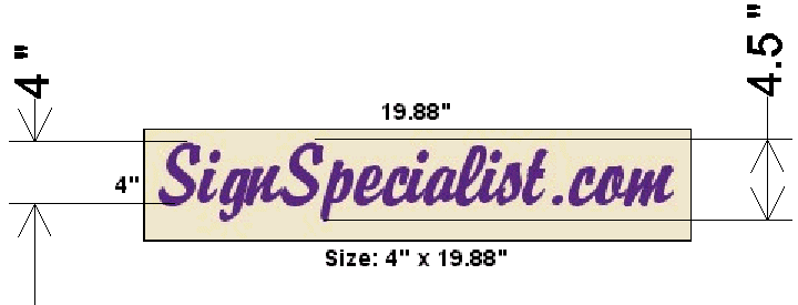
As far as the letter height goes, the preview can be slightly off. For instance, let's say you choose 4 inch lettering. This size is based on capital letters. So if you have the letter "y" in a letter style that drops below the base line of the capital the overall height will be slightly more than 4 inch. Also, so as to enable a background preview, we have increased the "negative space" around the image. This also can throw off the preview.
Here is an example to show what I mean.

Have another question about decals, signs, lettering,
or stripes? Search Our Website:
|